
The Feature Explorer is a tool window used for listing features, it is the main place from where you can access features (including their observations) and from where you can start a multitude of feature-related actions.
You can open the Feature Explorer from the Content & Structure Ribbon tab. The Feature Explorer will be automatically opened on the first start of the Smart Client. Since the Feature Explorer is the main window from which you can access features (including their observations) and many other feature-related functionality we recommend to leave this window open all the time.
The Feature Explorer has three main Panels:
•View Members: shows the result of a view execution (i.e. the view members)
•Selection: Showing the current user's personal selection of features
•Feature Sets: Sets of features that defined by the current user.
Using the drop-down list on the bottom of the window (figure 1: 1) you can manually switch between these Panels. The Smart Client will however automatically change to a specific Panel whenever the user performs an action that influences the data shown in that panel.
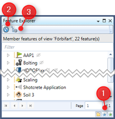
Figure 1: Switching between different panels of the feature explorer
The window's toolbar will change according to the selected panel, the Refresh button an the Node visibility button are however always shown. (Figure 1:2, 1:3). The information bar below the toolbar displays information about the displayed features, depending on the panel.
Features tree
Each Panel contains a tree view control that shows all features relating to this panel as root nodes. By expanding a root node you can explore the feature relations of this feature to other features. Which type of relations will be shown depends on the user's definition of node visibility that can be changed by opening the node visibility window from the toolbar (figure 1:3).
The layout of the tree views and the actions you can perform on the features shown there are nearly identical in each Panel.
Each feature displayed in the tree view shows plenty of information that allows you to gather the most important information of the feature quickly. Each feature is shown with the icon of the feature type or the feature subtype (if an icon was defined for that feature's subtype) - see figure 1:2. The icon may have an overlay (a small badge added to the icon) to show specific characteristics of the Feature. Table 1 explains the used overlays.
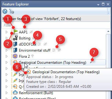
Figure 2: Display of features in the Feature Explorer
Icon |
Notes |
|
Feature with calculation data source (black ∑ overlay) |
|
Feature with connector data source (blue connector overlay) |


Table 1: icon overlays used in the Feature Explorer.
Right to the feature type icon the Feature name is shown (figure 2:4). Names of deleted features will be displayed using light gray text color.
The colored vertical bar left of the feature type icon (figure 2:2) shows the current Approval status of that feature, each approval status corresponds to a color as shown in Table 3.
Color |
Description |
|
In Progress |
|
Ready |
|
In Approval |
|
Approved |
|
Approval denied |
|
Approved but erroneous |
|
Approval aborted |
|
Approval exired |


Table 2: Color codes for the approval status of a feature
Right to the feature name (figure 1:5) additional icons are shown for specific features. Table 3 shows the icons that may be shown and their meaning.
Icon |
Description |
|
Feature is a platform feature |
|
Feature is part of a platform feature |
|
Observation monitoring is turned off for this feature |


Table 3: Additional icons used for describing specific feature characteristics
The tool tip text on each feature (figure 1:6) shows the feature name and other information about the feature.
The tree view allows you to select a single or multiple features, using the context menu you can then perform several actions on the selected features. The context menu will change depending on the selected features. The actions that can be selected from the context menu are nearly identical in each panel of the view browser.
The tree view on each panel can be filtered quickly by using the Filter box.
Opening Features
To open a feature, i.e. to open the Feature Editor window for a the selected feature you can select Open from the context menu of the feature or can just double click the feature in the Feature Explorer. Opening feature from the context menu will only be available if for up to 10 selected features, i.e. you can open 10 features in 10 instances of the Feature Editor at once.
If there is a specialized Feature Editor Window for the feature type of the selected features (e.g. for the document folder feature type) the context menu will include entries to open the feature with those specific windows or with the Feature editor.
When selecting Open from the context menu or when opening the Feature Editor by double clicking a feature the Smart Client will check if a Feature Editor for that specific feature was already opened, and if yes will show that instance of the Feature Editor. However if you intentionally want to open the same feature two times (e.g. for comparing data etc) you can select Open in new instance from the context menu (in this case please also remember that you are working with disconnected data7 ).
