Generic charts
Redbex provides a set of extremely versatile generic chart types like time/value charts, distribution charts, cross charts, polar charts etc. No matter which data you record in your Redbex installation these chart types can be utilized to visually represent your data in multiple ways. You can also easily compare data from different sensors in one chart.
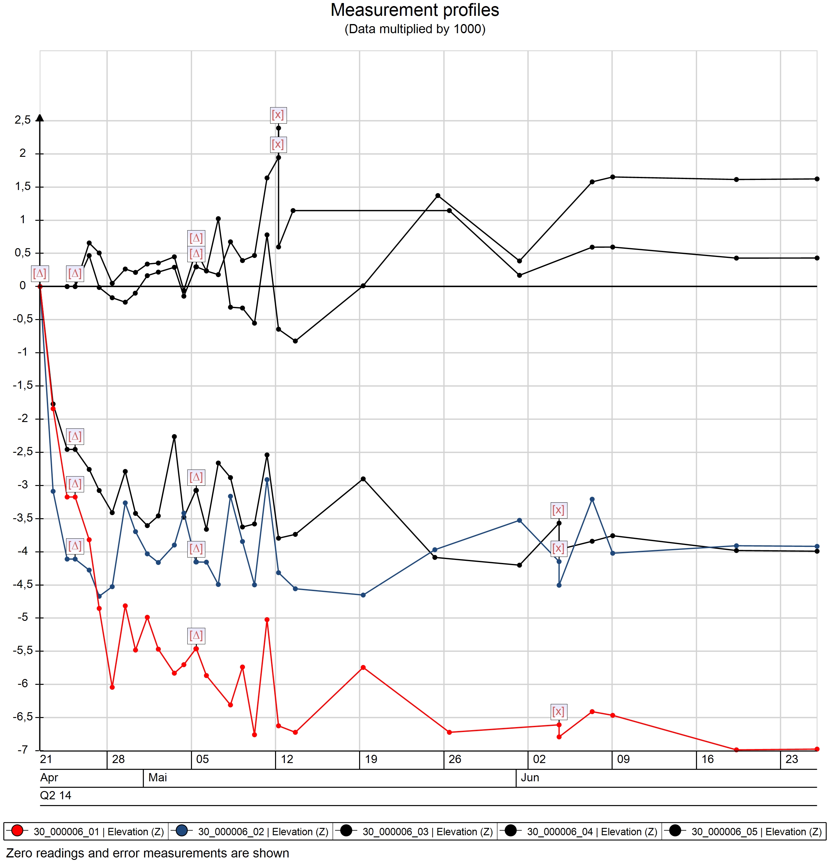
Represent any observed value you want on a time axis
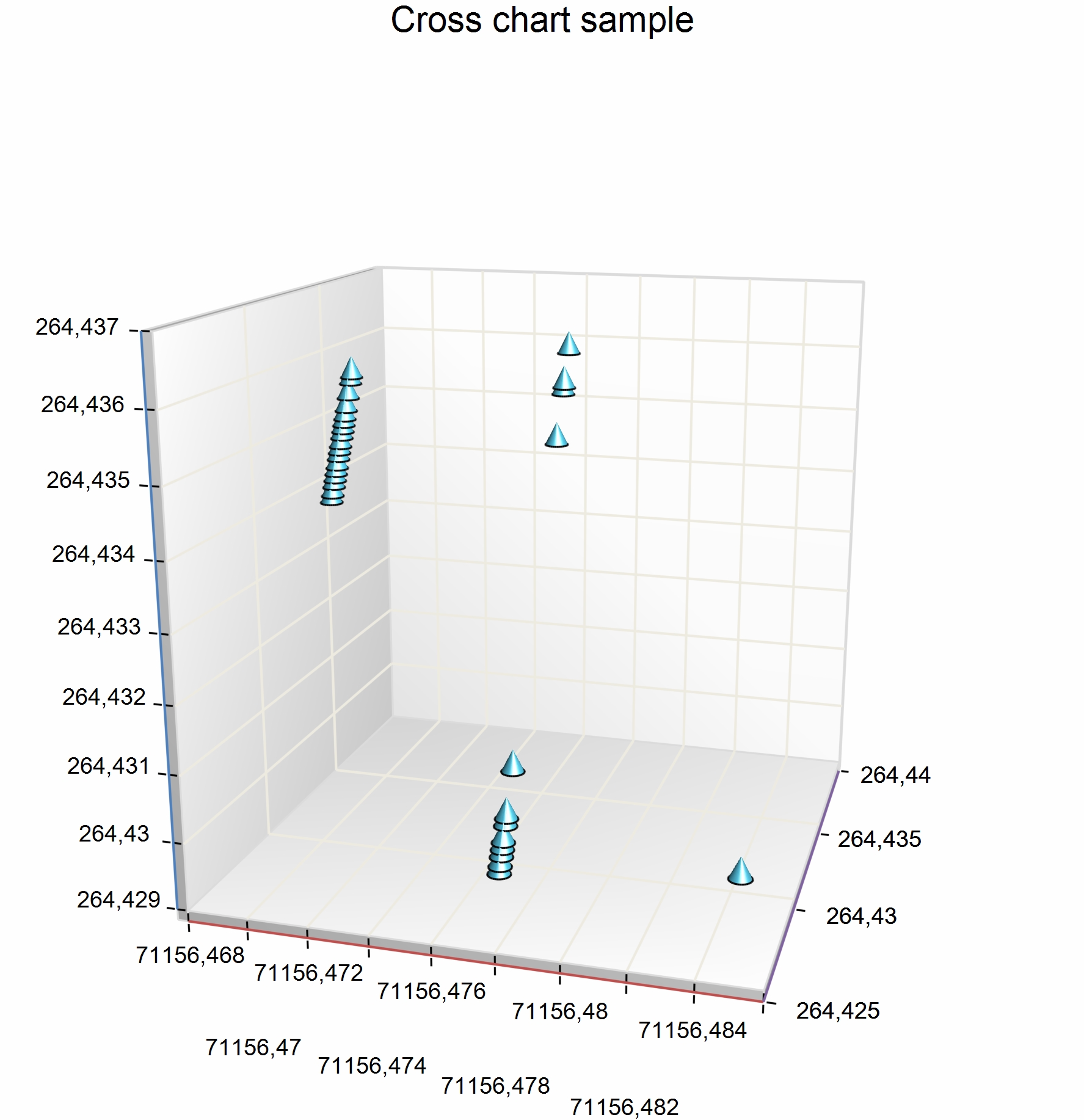
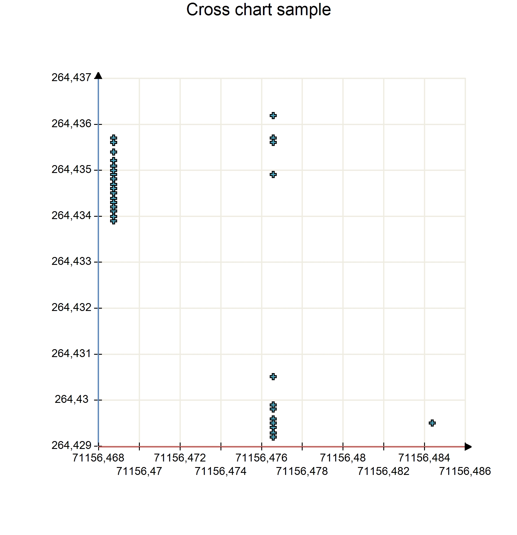
Represent values of sensors along a specified axis
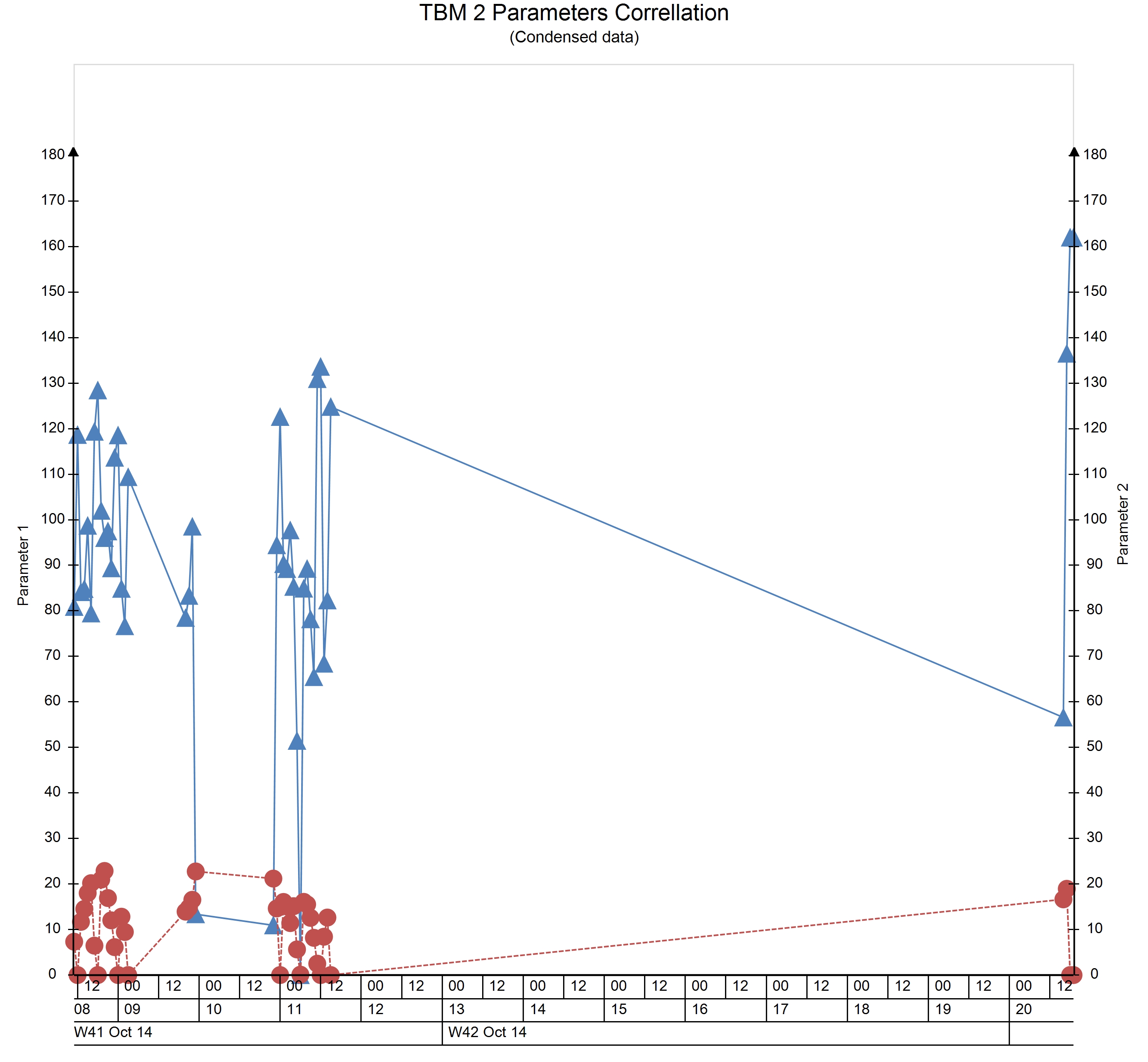
Compare multiple values with each other and find correlations
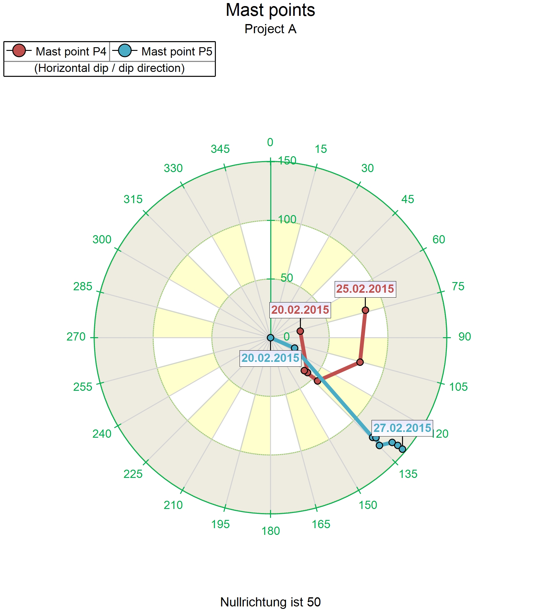
View how the value changes on a polar diagram
Analyse how some values are distributed in time
Specialized charts
While generic charts are extremely versatile, not everything can be covered by those charts. For the specific needs of some expert areas Redbex therefore provides a number of highly specialized chart types that help you to visualize data a way that is common in your specific expert area.
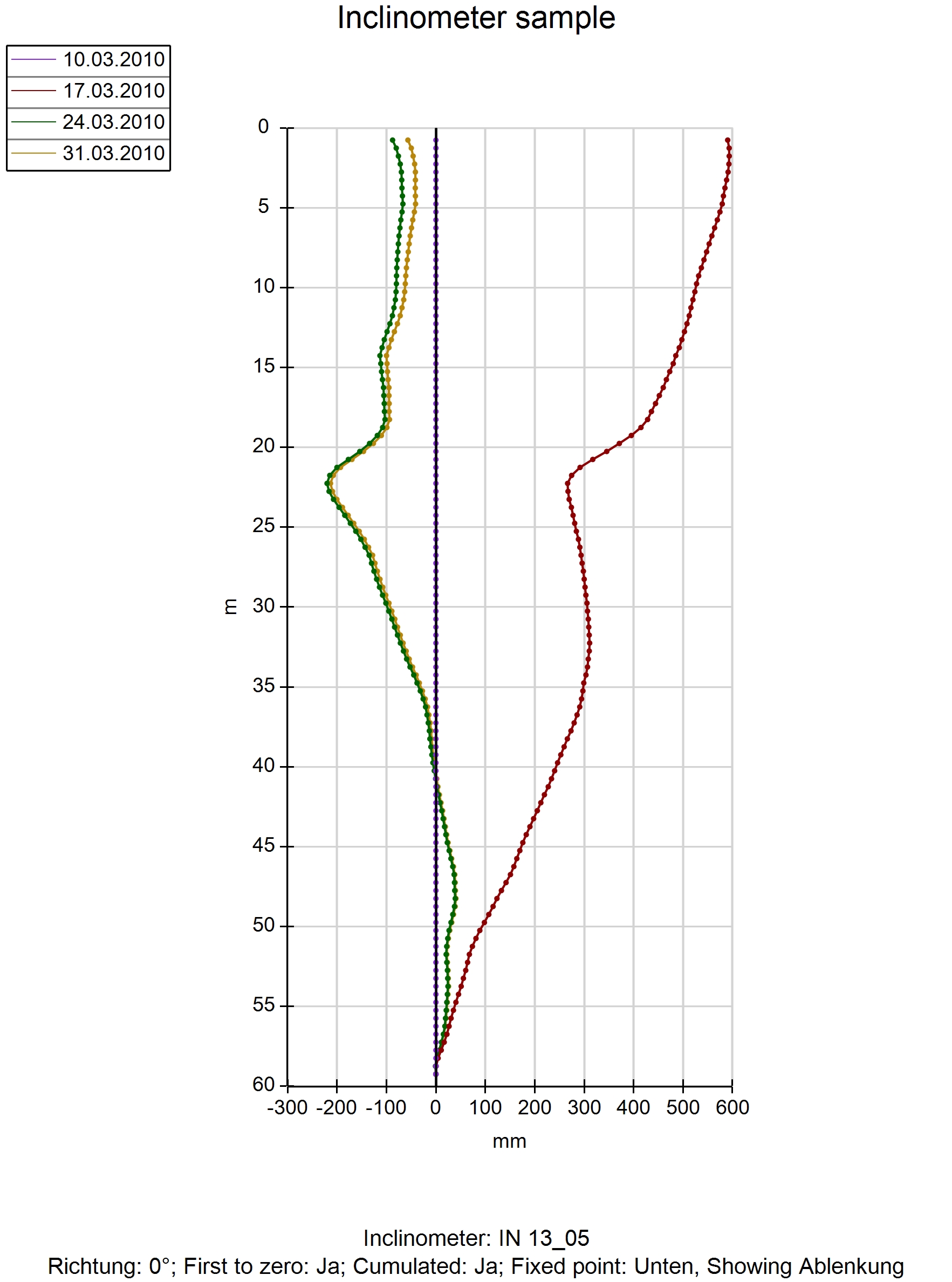
Standard evaluation and presentation of inclinometer data. Support vertical and horizontal inclinometer, different calculation types, definition of the fixed point etc.
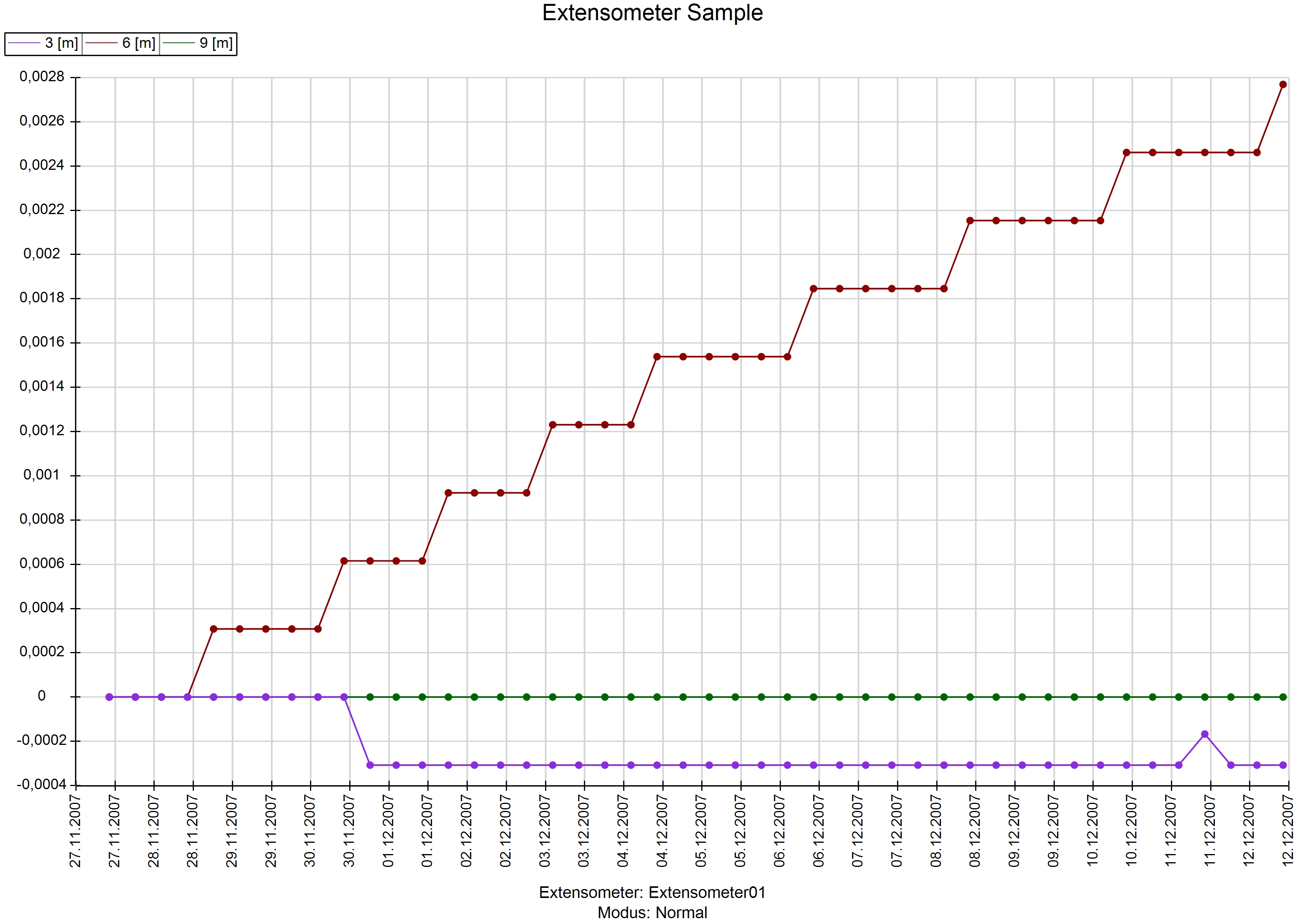
Standard evaluation and presentation of extensometer data. Showing differences between different rods.
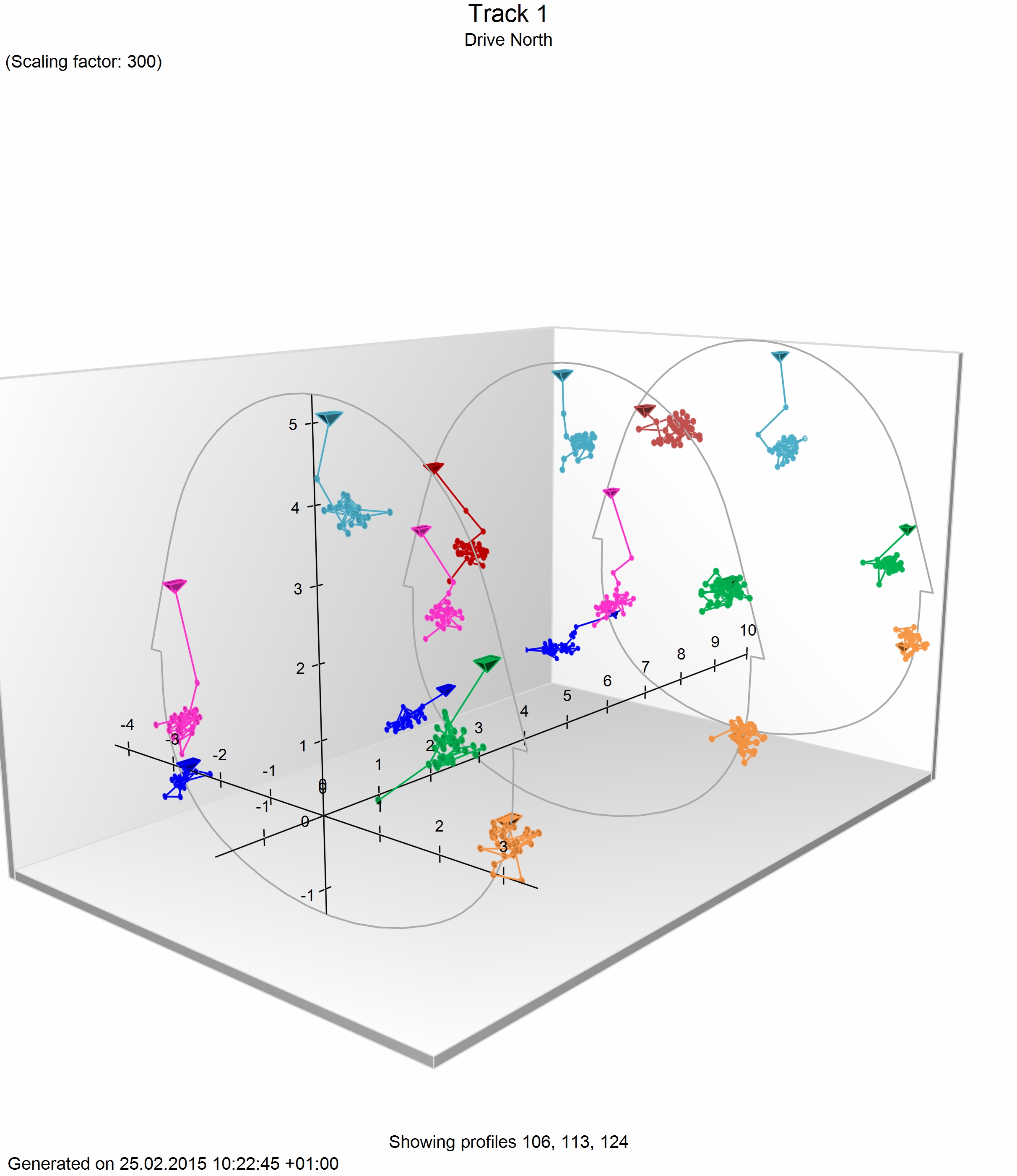
3D measurements within the tunnel can be visualized in the tunnel profile chart. Data can be combined with geological sketches for more accurate interpretation
Visualize 3D movements along the axis of your tunnel over time. State line charts are a widely used visualization technique that allows you to easily assess the movements in a tunnel.
Redbex integrates specialized chart types as plugins. Therefore Redbex is prepared to provide also those charts that are specific to your expert area.
")
")
")
")
")
")
")
")
")
1
2